Dialog boxes
Do not over-use dialog boxes. If a dialog box pops up, then it should usually be worth the user's while to read it.
Confirmation boxes that appear too frequently are useless; the confirming click becomes part of the action and the net effect is simply slowing the user down without gaining any safety. Whereever possible, operations should be undoable. This allows a fast interface without any confirmations, but also protects the user from all mistakes. Generally, therefore, it is only worth confirming an operation which would take a reasonable amount of work to recover from.
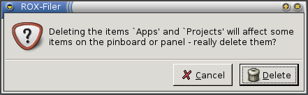
Do not use button labels like Yes and OK if there is more than one button. Instead, use a verb (such as Delete or Send). If the user knows what their options are (eg, whether the data is to be saved) then they should be able to work out which button to click without reading the text. This also prevents mistaking one dialog for another, eg:
- Do you want to save? : Yes
- Really quit without saving? : Yes
Using image icons in the buttons can also help here.
Buttons
The GNOME developers have decided on some guidelines for button ordering which seem pretty sensible. The basic idea is that the 'Yes, do it' button goes in the bottom right corner. This is not necessarily the safest choice. We have moved across to this system too.
Note: we're not following all of GNOME's advice on dialog boxes, so don't do anything stupid like this (note the two negatives!)...
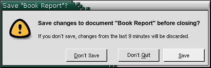
Instead, just open the normal save box, but with an extra 'Discard' button. The user already knows how the save box works, so there shouldn't be any confusion.

Errors
When reporting errors, always say why the error occured. Sometimes it's difficult to know the root cause of a problem, but you must have had some reason to have shown the box in the first place... tell the user whatever you know. Don't do this:
If you are using ROX-Lib, uncaught exceptions will be automatically displayed in a box like this:
You can catch specific errors and make them more user-friendly (the above screenshot, created by saving from Edit to root's home directory, isn't ideal). In general, I prefer to err on the side of providing too much information than too little (which path was read-only may be obvious in some cases, but completely non-obvious in others). I'd rather a user sees the stack-trace box with full details when they don't need it, than not get the information when they do.
The ROX-Lib error dialog also has a Details button which provides access to the stack trace, local variables and an interactive Python prompt for more advanced users. This is open source; encourage users to explore!
Never catch all errors and just assume what the problem was. MS Word does something like this:
try:
   doc.save()
except Exception:
   alert('Disk full. Try deleting some files.')
Users can delete a lot of important files before someone less trusting of error messages helps them out ;-)